Beautiful and attention-grabbing graphics are a must for blogs. Having a beautiful theme and quality content is only part of what a blog needs today to succeed and stand out. Your blog graphics are the billboards for your content and will help draw in readers.
One of the best and easiest ways to grow your blog is having shareable images for Pinterest, Facebook, and social media. This way your readers help your blog grow by sharing your content with their family, friends, and followers. Improving your blog graphics is an easy way to boost your blog traffic.
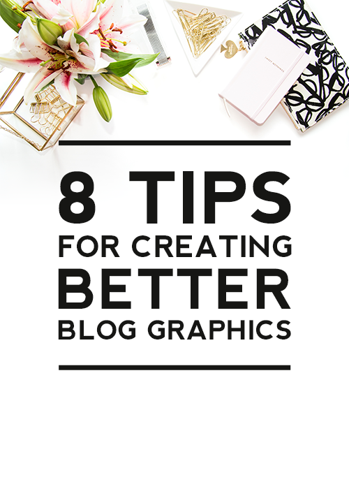
Following a few basic design guidelines can help elevate your graphics to a more professional level. Below we share 8 tips for creating better blog graphics by focusing on three main principles of design: colors, images, and text.
1. Use Your Blog’s Color Scheme
Use your blog’s color scheme as your guide for picking complementary colors for your blog graphics. One thing to keep in mind when creating graphics is to avoid having your blog graphics clash with your blog. One of the best ways to prevent this is to use your blog’s color scheme to ensure all of your graphics coordinate with your blog.
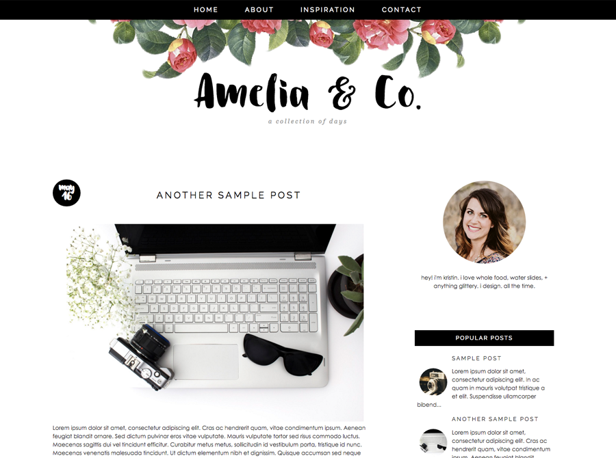
As seen in the above designs, the colors and fonts from the blog’s color scheme and design were used to create the complementary blog graphic.
For special occasions such as Halloween or Christmas or a guest post, it is okay to use colors outside of your color scheme but 90% of the time your blog graphics should use your blog’s color scheme in some way to tie your graphics to your blog.
If you have a rainbow blog scheme or use several colors, pick a few dominant colors and use at least one of them in all of your blog graphics. This will help your blog graphics appear consistent even if you have a colorful color scheme.
This tip also helps your blog develop its own identity for when your graphics are shared on Pinterest, Facebook, or Instagram. When people see your graphics, they will know they are yours because they will have your signature style.
RELATED POST: 4 Tips for Finding the Perfect Color Scheme for Your Blog
2. Use Your Blog Design for Inspiration
Use your blog design images as inspiration for the text, icons, patterns, and shapes used in your blog graphics.
Your blog header can be used as inspiration for your blog button, subscribe graphics, social media images, etc by using a similar theme as your header across each of these graphics. For example, if you use a sunflower in your header, tie everything together by using sunflower icons or a sunflower pattern or the color yellow as a border or color tint in your graphics.
For your blog posts, if you have an image of a watermelon for a summer picnic blog post, use the pink or green from the image for your font colors and add a small watermelon icon or watermelon pattern to your image to tie everything together. Another quick and easy way is to use a dominant color from your blog header as the color for the shape behind your text in all of your blog post images. This easily ties your blog posts to your blog.
This tip can also be used for other images on your blog–like charts or graphs–by mixing design elements from your header in different sizes and colors to create a visually dynamic way of presenting information.
3. Use Quality Images
The top way to improve your blog graphics is to use high quality, professional images. This means using crisp and clear images with good composition. Pixelated images or blurry images with numerous filters taken with your phone should be kept for your social media and not as a featured image on your blog.
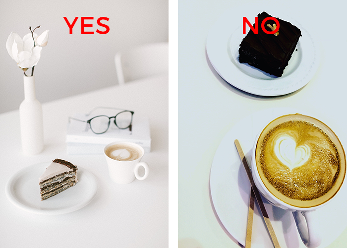
As seen in the above image, the left appears much more professional by the crisp quality and good composition compared to the right image which has a poor composition and a blue filter applied to the image. It is easy to see which image would lead to more traffic.
Another trend is to use natural looking stock images. Using stock images that appear real and organic help convey a more authentic experience as your readers read your blog. Images that are good for creating a natural feel include images from nature, naturally staged objects and architecture.
If you aren’t a photographer, there are numerous resources online for free stock images to use for your blog.
RELATED POST: The 4 Best Places to Find Free Photos for Your Blog
4. Use Images That Spark Emotions
Your blog graphics should convey emotion to your readers. Images that spark emotion make readers more likely to share your post or click on your graphics. For example, if you are sharing a happy and emotional post about an accomplishment, your image would be colorful, bright and spark feelings of joy. You might also use confetti, a cake, or a smiling person to help elicit this emotion.
Research shows images that spark emotions are more likely to be shared and go viral. There are numerous feelings that can be evoked in your images including inspiration, happiness, curiosity, empathy, awe, calmness, etc. Help your blog be more shareable by using blog graphics that relate to your content and make your readers feel emotions.
5. Use the Right Backdrop and Text Placement
If your blog graphics will have text on them, the best images to use are images that have a natural blank area or images with simple backgrounds. Text placement on the right backdrop can make or break a shareable image.
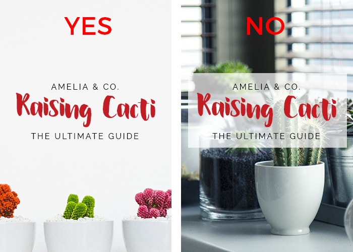
The above image shows how the right background makes or breaks an image. The left image has a natural blank space for the text and appears more tidy and professional. The right image has to use a white rectangle placed behind the text in order for it to be legible. A more simple background should have been used in the image on the right.
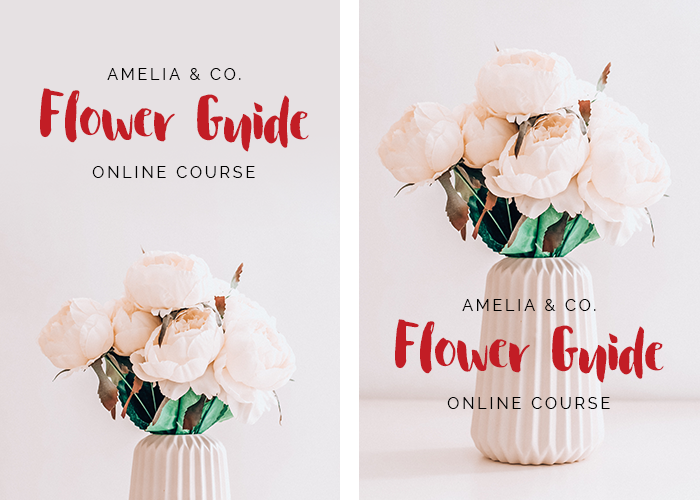
The above image shows different ways of moving the text and cropping the image to create two different, yet balanced images.
The goal when using text on an image is to make the image appear as a backdrop and not the main focus. The text should be the focal point so when the image is shared on social media, it’s easy to read and quickly grabs your reader’s attention.
RELATED POST: 10 Ways to Use Stock Photos for Your Blog and Beyond
6. Use Catchy Text
The text you use on your images has only seconds to grab your reader’s attention, so it’s important to use attention-grabbing text that makes them want to find out more.
As a featured image on your blog, your text should be powerful and focused. Remember this is the billboard for your content. Use words that would entice readers to read more.
As a part of your blog post, the text used in your blog graphics should flow with your content. Pick memorable quotes from your post that would spark a conversation with your reader. You could also use something you want your reader to remember long after reading your post. Other highly shareable texts you can use are short inspirational mottos or famous quotes that relate to your content.
RELATED POST: 6 Tips for Writing Attention Grabbing Post Titles
7. Use Mixed Typefaces
Add variety to your images by mixing up your typefaces to create compelling images. This helps your images appear more dynamic. If you have a long quote or text in your graphic, it helps break up the monotony by adding points that stand out.
Using mixed typefaces is especially important if your graphics are almost all text on flat backgrounds as your text will have to do all the work of drawing in your readers.
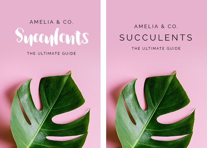
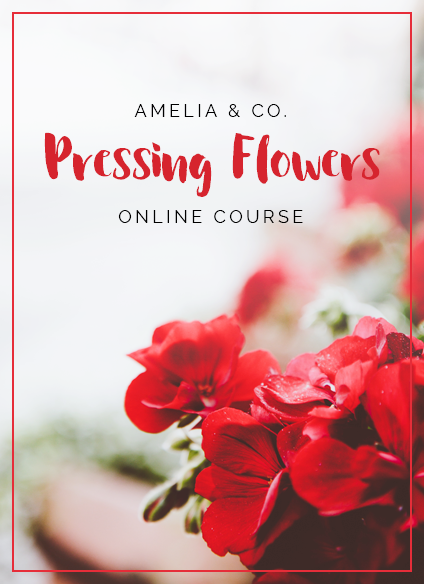
The above design shows how much more dynamic the text feels by mixing typefaces.
It is important to place the right emphasis on the right words. Use your fancy font for where you want to add extra attention. A good rule is to use your fancy typeface only about 20% of the time.
Good rules to follow are mixing serif with sans-serif fonts, serif fonts with script fonts, or sans-serif fonts with script fonts. Script fonts should not be mixed with other script fonts unless one of them is a simpler font. Less is more when combining busy fonts together.
RELATED POSTS: The Art of Mixing Typefaces & Eight Great Font Pairs
8. Choose the Right Fonts
The fonts you use should fit your blog and content. The best way to do this is by using the same fonts used in your blog design for your blog graphics. This automatically coordinates your blog graphics with your blog.
Avoid distracting fonts or fonts that are difficult to read. No matter how pretty a font is, if it is difficult to read, that font should not be used for your graphics as it will hurt your blog more than help it. Most readers spend seconds to decide if they want to read a post or find out more information from a blog graphic.
If your blog uses all serif or sans-serif fonts, a good way to add variety is to add one script font to your blog graphics and then using this script font throughout your graphics as a way to tie it into your blog.
RELATED POST: How to Use Fancy Calligraphy Fonts


Leave a Reply