It’s not a secret that more and more people browse the internet on their mobile devices every year. Looking at today’s statistic form our site, 37% visits from last 30 days comes from phone and tablets. Those are some pretty crazy stats! With this increase in mobile device use, it becomes more important to have a mobile responsive site.
What is mobile responsive coding?
It is usually part of your design that makes your site look good on all popular screen sizes. This way, you can browse your website on the phone or tablet, and all the content is clearly visible and easy to read.
Having a mobile responsive site creates a better user experience for mobile users and has been shown to increase traffic, decrease bounce rate (that means your readers are sticking around longer), and has been shown to increase page views.
How can I check if my site is responsive?
The easiest way will be to visit it via one of your mobile devices. However, you can also use sites like Am I Responsive to see how your site looks on various mobile devices. As an example, check the screen below of one of our designs (Gloria).

All our Blogger templates and WordPress themes are mobile-friendly.
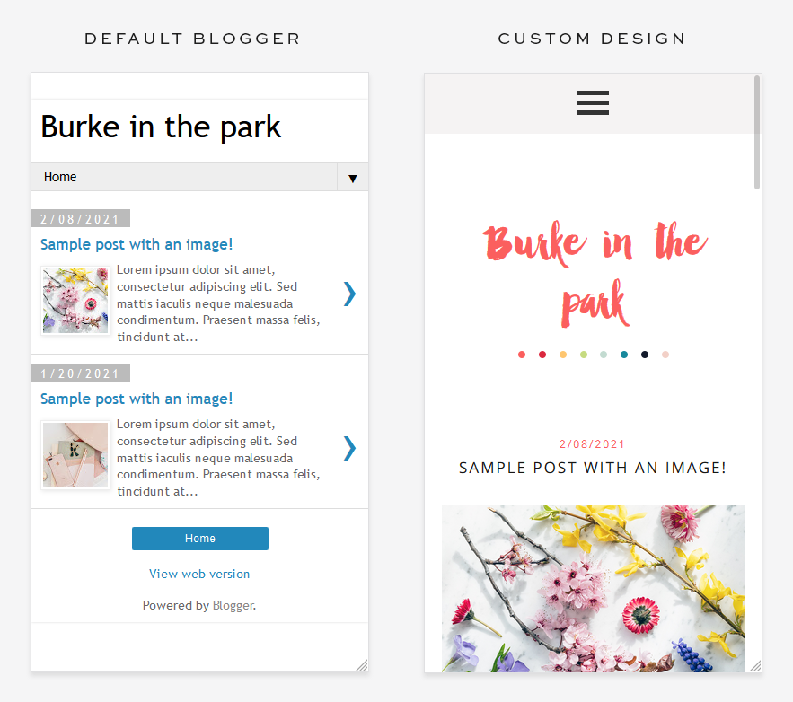
Default Blogger mobile design
Indeed, all Blogger designs (whether or not you have a design from us) come with Blogger’s default mobile coding; however that coding does not allow many of your design elements to show. Rather than showing your beautiful header design, it may show only default text. Our mobile coding codes the site to allow all design elements to display beautifully on mobile devices.
Here is a comparison of our design vs. default blogger one for our Burke Blogger template.
How to turn off default Blogger mobile template
Default Blogger view is always turned on for all blogs, so if you know that your design comes with custom mobile responsive coding, you need to go to your Dashboard and visit the Theme tab.
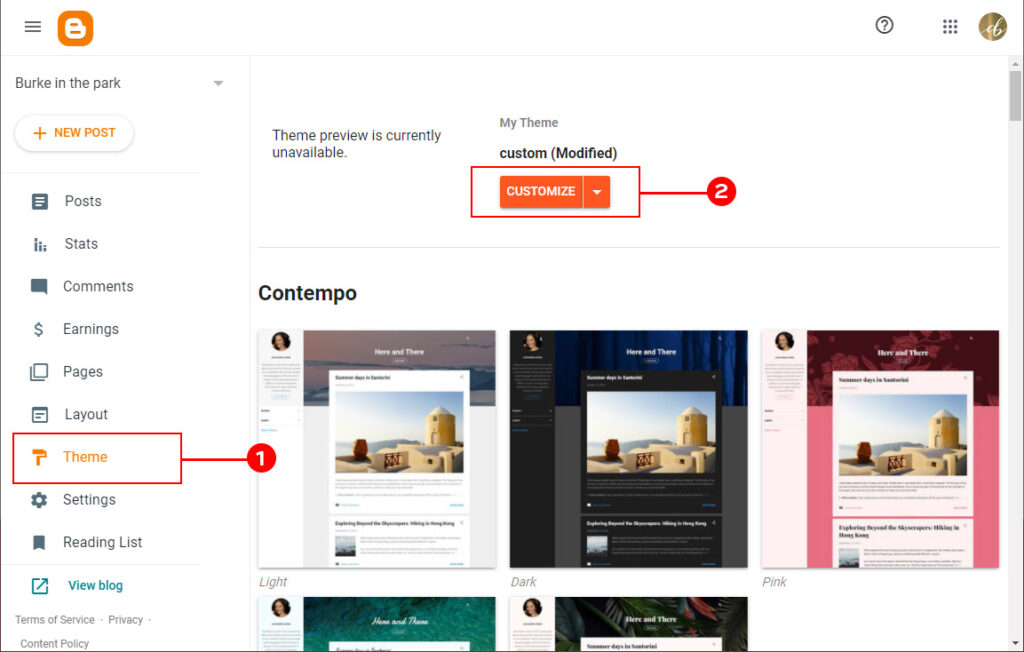
Once there, click on the orange Customize and pick Mobile Settings from the drop-down menu.
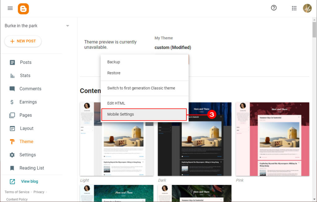
A new window will pop up. Check the Desktop option and remember to save changes.
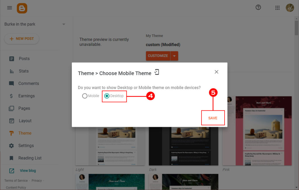
That’s all! Your Blogger is now ignoring the default mobile template provided by Blogger.
WordPress & mobile coding
WordPress does not have default mobile coding built-in. To make your site mobile responsive, you need to either get yourself a design that includes such a feature or install a plugin that will add mobile coding to your site.
Without mobile responsive coding on WordPress designs, you see the entire design as you would see it on a computer screen, and then you have to zoom in and out to view and access the content. Mobile responsive coding neatly organizes all of the content nicely within the width of the mobile screen so all links and content can be accessed and viewed easily.


Leave a Reply