Do you love the look of Polaroid photos? There is just something so cool about retro Polaroids, am I right or am I right?! Well today I’m going to show you how to give your Blogger post images this Polaroid look:

Step 1
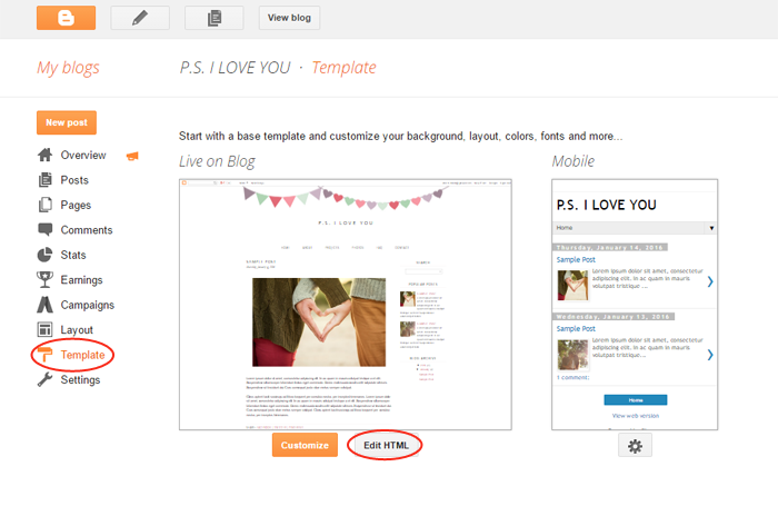
Log in to your Blogger account. In the dashboard click Template > Edit HTML.
Step 2
Click your cursor anywhere in the code box and then hit CTRL + F to open a search box and search for this code:
.post-body img
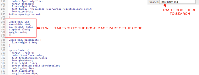
Step 3
Highlight all of the post image code as follows:

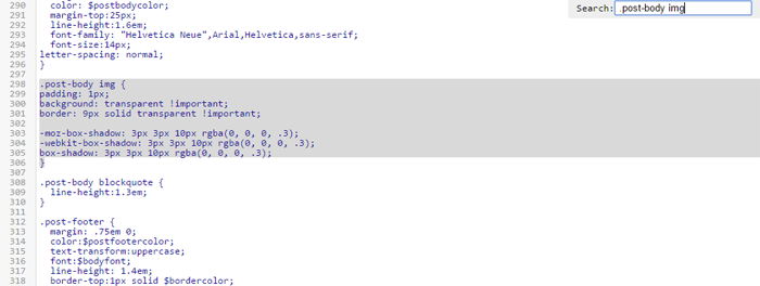
…and replace it with this new code:
.post-body img {

padding: 1px;

background: transparent !important;

border: 9px solid transparent !important;
-moz-box-shadow: 3px 3px 10px rgba(0, 0, 0, .3);
-webkit-box-shadow: 3px 3px 10px rgba(0, 0, 0, .3);
box-shadow: 3px 3px 10px rgba(0, 0, 0, .3);
}
Save and view your new Polaroid images!
Note: This code will give ALL the images in your posts a drop shadow and border. So if you have a signature I would recommend removing it.
How to Customize the Coding
If you want to increase or decrease the sizing of the white border, adjust the 9px in the code:
.post-body img {

padding: 1px;

background: transparent !important;

border: 9px solid transparent !important;
-moz-box-shadow: 3px 3px 10px rgba(0, 0, 0, .3);
-webkit-box-shadow: 3px 3px 10px rgba(0, 0, 0, .3);
box-shadow: 3px 3px 10px rgba(0, 0, 0, .3);
}
A larger number like 12px will make the border thicker. A smaller number like 5px, will make the border thinner.
If you want to darken or lighten the shadow, increase or decrease the .3’s in the code:
.post-body img {

padding: 1px;

background: transparent !important;

border: 9px solid transparent !important;
-moz-box-shadow: 3px 3px 10px rgba(0, 0, 0, .3);
-webkit-box-shadow: 3px 3px 10px rgba(0, 0, 0, .3);
box-shadow: 3px 3px 10px rgba(0, 0, 0, .3);
}
A larger number like .8 will make the shadow darker. A smaller number like .1 will make the shadow lighter.
Please leave a comment or email us at [email protected] if you have any questions or would like to suggest an idea for a future tutorial.


Love this tip!! Thanks for sharing!
I can find .post but as soon as i put .post img, it doesn't find a match… there's ".post-body img" this looks like the same thing…but i'm not sure! Help! I would love to do this with my blog!
@Krystal — It looks like you are using the Simple template. This tutorial was written for the Minima template. From the looks of your CSS it looks like the shadow code is already in place. I would just alter the padding numbers and see what different looks you can get. Remember to save your template just in case!!
I am having the same issue as a earlier comment… I cannot find .post img… but I would still love to do this on my blog.
http://livingwithporteous.blogspot.com
@Ann — This tutorial was written for the Minima template and it looks like you are using the Blogger Ethereal template. So I looked and I think this is the code you are going to want to try:
.post-body img {
padding: 8px;
}
But be sure to preview before you save anything and remember always back up your template!
This is really cute and I would love to do this on my blog. When I tried doing it I didn't get the polaroid effect, all it did was make my black border disappear. Do y'all have any suggestions for what I might be doing wrong?
Hi Amy!
Be sure that this is the code you are replacing:
.post img {
padding:2px;
border:1px solid #382c1c
}
Feel free to email me if it still doesn't work. Maybe there is some code I added when I designed your blog that I may need to alter for it to work. Let me know if you get it or not!
Awesome I love neat tricks like this!
does this coding work for css in wordpress?
My blog currently does not have a border in its style, where then would one put this? I currently manually add the border to each of my pictures.
@Amanda – I'm not sure if it will or not. Worth a try though!
@Lisa – I just checked your blog and it looks like you got it working. 🙂
Actually, No. LOL. I currently manually add the border to my pictures which takes so much longer.
@Lisa — It looks like you are using one of the templates from the template designer. This code is meant to be used in the minima template. I've looked through your CSS and I'm not really sure where to add the polaroid code as I'm not super familiar with your templates HTML. I'm sorry!
UPDATE: if the above code does not work, try adding this one instead:
.post-body img {
padding: 1px;
background: transparent !important;
border: 1px solid transparent !important;
-moz-box-shadow: 3px 3px 10px rgba(0, 0, 0, .8);
-webkit-box-shadow: 3px 3px 10px rgba(0, 0, 0, .8);
box-shadow: 3px 3px 10px rgba(0, 0, 0, .8);
}
Hi, I just found you page and I love it! I would like to use this tutorial but it is not applicable to the code of my blogger page? Could it be that something has changed since you wrote this post? Greetings from Germany 🙂
Yes, unfortunately this is an outdated tutorial. We will try to update it in the coming weeks.
The tutorial has been updated as of 6/8/16.
Thanks. Your guidance and tips are important and we appreciate your efforts for sharing this great information!