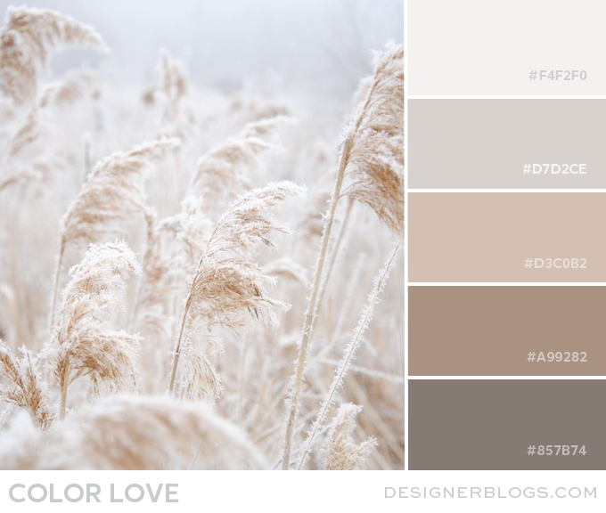
Soft Neutrals Color palette is all about soft but warm colors used all year round. Color schemes such as khaki, brown, taupe, white, ivory, beige, and gray can produce a calming and comfortable atmosphere. In the context of design, neutral means without color however, our color palette is colorful even though it uses shades of the same color.
Soft Neutrals Color Palette
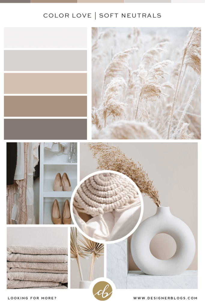
Using different shades of the same neutral color in design creates a classy and sophisticated look. Below I have created a simple mood board featuring today’s color combination. It is in perfect Pinterest format, so feel free to pin it for later.
See our collection of other gorgeous color palettes by visiting our color palette section.
What do you think about soft neutral shades? Where would you use them? I think it will look great both for interior design and digital arts. There are really no limits here. We would love to hear your thoughts, so make sure to share them in the comments below.
Lastly, learn about the power of color in blog design in our blog post to see how important colors are in all the projects you create.
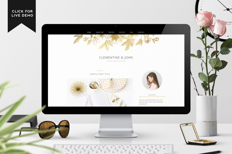
If you are looking for something more vibrant than our soft neutrals color palette, make sure to check our Blogger Templates where you will find pre-made templates like the Clementine below.
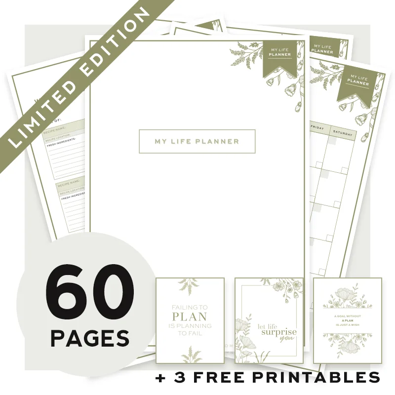
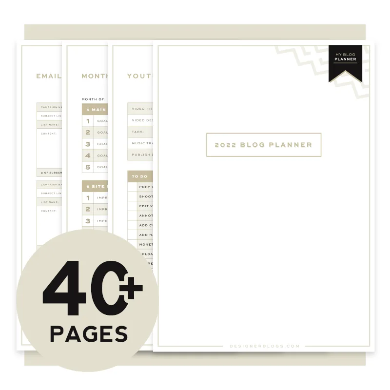
If you prefer softer shades, make sure to check our planners!
If you create something using today’s color palette don’t forget to share it with us!


Oh, I’m loving it!;-)<3
http://www.blogellive.com