Today I want to share with you a fun little trick for automatically resizing your Blogger photos to fill the full width of your post area. Blogger offers several tools for resizing post images easily. I’ll get to my little trick in a second, but first I want to explain how to use the Blogger tools for uploading and resizing your photos for those that don’t already know.
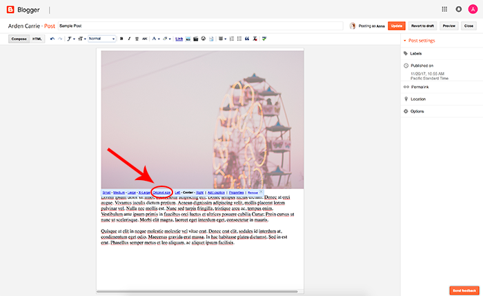
To use the Blogger resizing options, simply create a new post, add a photo, and then click on your uploaded photo to open the sizing and positioning options.
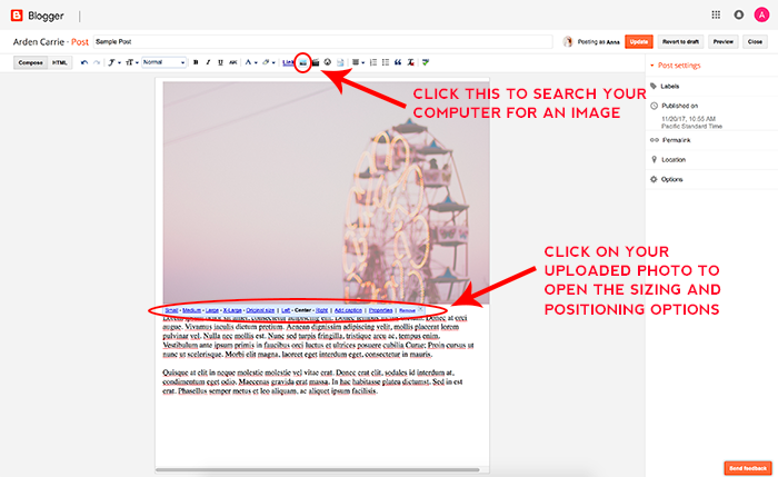
You can set the photo size to small, medium, large, x-large, or to its original size. You can also set the justification to left, center, or right. I recommend centering your photos and using the x-large setting (if you don’t use the trick below) so your photos can be seen in all their glory. The only draw back to using this option is that the x-large size sizes images to 640px, which means if you have a post area that is wider than 640px, the photo will still look a little small. That is where my fancy little trick comes into play, so let’s get to it!
RELATED POST: The 4 Best Places to Find Free Photos for Your Blog
STEP 1: RESIZE YOUR PHOTO
Resizing your blog photos is an important step regardless of whether or not you plan to use this photo sizing trick. This tutorial will still work on photos uploaded in their original size but because uploading original sized photos slows your site WAY DOWN, it is not recommended. The larger the image size, the slower it will load on your site…so trust me, just don’t do it!
Most blogs have a post area width somewhere between 600px-750px, so sizing your photos to 800px wide should work well on most blogs. You’ll want your image to be sized a little larger than your post width with this tutorial because it’s easier to bring an image down in size than it is to bring a small image up in size. Enlarging a small image will cause it to become pixelated and the quality will be low. So to keep things looking good, I recommend sizing your images to around 800px wide with this tutorial.
RELATED POST: 10 Ways to Make Your Blogger Blog Load Faster
STEP 2: ADD A LITTLE CSS
Now that your image is sized correctly you’ll need to add a little coding to achieve the automatic re-sizing. Don’t worry, you don’t need any coding experience for this.
1) First open up your Blogger dashboard and go to “Theme” and then “Customize.”
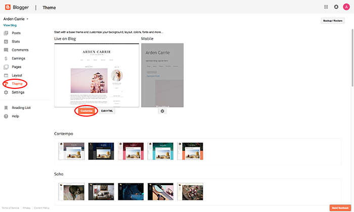
2) Click “Advanced” and then scroll down and click on “Add CSS” and copy/paste the following code into the white box:
.post-body img {

max-width: 100%;

max-height: auto;

display: block;

margin: auto;

}
It should look like this:
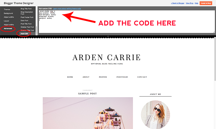
Note: the above code will only change the images you have set to “Original Size.” If you want ALL of your images to be sized to the full post width regardless of the Blogger re-sizing options you have them set to, add this CSS instead:
.post-body img {

width:100%;

height:100%;

display: block;

}
Now click “Apply to Blog” to save your changes.
RELATED POST: How to Achieve Pixel Perfect Images in Blogger
STEP 3: ADD A PHOTO TO A POST
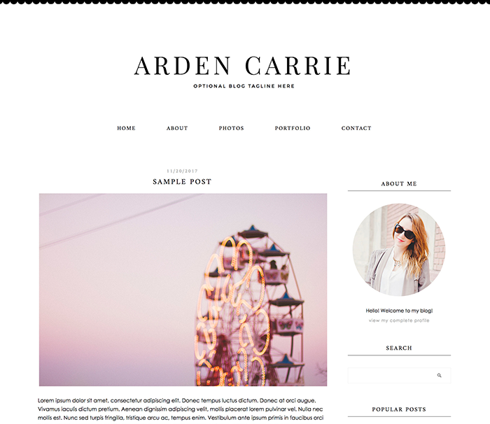
Now just add a photo to a post like described in the beginning of this tutorial and make sure the photo is set to “Original Size” and your photo will now nicely fill the full width of your post area once you hit “Publish.” This trick will also apply to all previously posted photos as long as the photos are set to “Original Size.” If not, then you’ll want to use the second code option above.
Oh so big and pretty!
Please leave any questions you may have in the comments and I’ll do my best to answer them. Otherwise, enjoy your lovely automatically resized photos!
RELATED POST: SEO Quick Tip: How to Title and Size Images for SEO


Cool trick and you are right its always better to keep the image full size than having it sized small.
thank you so much for your codes! Works perfectly on my blog <3
We can use a very fast image resize tool at http://imageresizertool.com. It works like a charm.
Hello,
If I use the first code (“add a little CSS”) when uploading multiple photos, the photos are not aligned on width. And if I use the second code (as now), the pictures are aligned in width, but there is a loss of quality.
test-my-blog-1.blogspot.com/
What could be the problem here?
This is because the original image size of the vertical photo you are referring to is smaller than the width of the blog, which causes it to become pixelated when you enlarge it. You need to make sure the size of the images uploaded to your blog are sized no smaller than the width of your post area, which for you would be 570px wide. Any photo uploaded that is smaller than 570px wide will have a loss of quality when enlarged to the full width of the post area. Hope this helps!
My photos look blurry too even though I sized them all larger than the blog post width. It’s frustrating! If anyone knows why this is I’d love to know!
Leave us a link to your site so we can take a look at what might be causing the issues.
This helped SOOO much!! Thank you!!!
Very helpful Thank you so much!!!
Oh my gosh, this worked so well! THANK YOU so much for this! So helpful!
So this is strange, but I don’t want this on my blog and it came automatically. I use a lot of smaller images and would prefer them to stay smaller then pixelating out so bad. How would I change the code to make it not automatically resize? Thank you
Hi DeAnna,
Your design is not a design by us, so your coding for this may be different, but to remove this feature, you should be able to go to Template > Edit HTML and click your cursor anywhere inside the coding box and hit Ctrl + F to open up a search box. Then search for the code the tutorial tells you to add to activate this feature:
.post-body img {Full code would be something similar to this:
.post-body img {max-width: 100%;
max-height: auto;
display: block;
margin: auto;
}
Then, instead of adding it like the tutorial instructs, just delete that block of code and it should revert your settings back to the default photo settings.
Hope this helps!
Thank you so much! I found it and figured it out!
I would like to make my photos bigger but my problem is if I go to the X large format they run over the allotted text area for the post. Did I miss something?
Are you following step 1 and resizing your photo first?
Hey! I’m new to blogging, so getting the quality and everything right on my blog is rather frustrating. I used the code and it prevented my photos from being cut off when viewing them on my phone, which is great. However, now some of my photos appear smushed in, when viewing them in the web version on my phone, in order to fit on my blog, which looks weird. Also when I view the mobile version on my phone, the pictures are blurry in comparison to my computer and viewing them in the web version. I use lightroom to edit and export my images. I do have photoshop but I prefer to use lightroom. I tried exporting with the width 800 and height 569. Lightroom doesn’t seem to automatically adjust the height for me. This is my blog: http://swayedbythedecade.blogspot.ca/
I recommend using a photo editor that will automatically adjust the height based on what you size the width to, to avoid these issues.
Hello, thank you for saving me
it’s hard uploading 736x3000px on blogspot and then they resized it, when I used photobucked, they resized it too. So when I used your code:
.post-body img {

max-width: 100%;

max-height: auto;

display: block;

margin: auto;

}
the photobucket worked. (image source file – full sized)
Awesome to hear! Thanks Eizu!
Great tip, thanks! Valerie
Thank you sooooooo much for this can’t tell you how helpful it was for me getting started on my blog.
Thanks, Alice x
http://www.aliceadventures.co.uk
Hi
I have tried both of your codes but only the first photo in my latest blog entry has changed size, is there a way to change all the existing blog photos to extra large instead of the current size medium.
http://jeg569.blogspot.co.uk/
I took a look at your site and it looks like you’ve gotten it figured out. If not, let me know and we’ll see what we can do to help.
Thank you for this helpful tip! I love it except for when it is used on vertical images because I feel like they take up my entire post! Is there any way to change it just for vertical images?
We will look into a fix for this. In the meantime, try setting the vertical images sizes manually using this tutorial: https://www.designerblogs.com/tutorial-uploading-larger-pictures-in-blogger/
Is it possible to disable the automatic resizing for one specific photo within a blog post? I can’t find the answer to this anywhere, would love your advice! Thank you!!
Hi Cait, you can try applying this tutorial to the photo you want resized in a post and see if that works: https://www.designerblogs.com/tutorial-uploading-larger-pictures-in-blogger/
Great information on sizing of images with a step by step procedure that leave no doubt about choosing a particular size of image for one’s respective blog-post area. I have recently started blogging and was in trouble with choosing the proper image size. Thank you..
This worked perfect for my blog, thank you so much!!
Thank you very much – I wonder how I can take it away?
What if your images are already small. I have one thats 200 x 200 and is very blurry when I upload it as my blog featured image. Really needed to publish it today but cant with it looking like this 🙁
Dear Erin, thank you very much for all the awesome tips, tricks and tutorials you so generously share. I have just started a blog, and it’s still in the ‘Lorem ipsum’ stage until I have everything nicely and neatly set. I have applied all the instructions but there is still some space left on the sides of the images. Could you maybe have a look and tell me what to do? Please and thank you.
https://ellieharperbeauty.blogspot.hr/2017/08/lorem-ipsum-5.html
Thanks for sharing the tips for resizing, i was wandering how can we reduce the size of image on blogger, in PageSpeed am getting 10% out of 100 for my blog http://www.bhejafrynews.com and all because the size of images.
Just wanted to say a HUGE thank you for posting this! Worked perfectly for making the Mobile Version of my blog scale down!
Awesome! works just fine 🙂
Hi, this is a great tip.
However I have another problem. I post pictures of different sizes with my text on a page. The problem is the pictures aren’t aligned properly with the text, meaning the height of the picture is uneven which makes the page look awkward. I have left a link to one of my post and you if you scroll down the pictures I have added, you will see what i am talking about.
Hope you can solve this problem.
https://animedry.blogspot.com/2018/01/knight-magic-review.html
I have just checked your blog and it seems that this align issue is caused by a large spacing between your text lines. Every image you add has its own padding on the side and at the bottom to make sure it will not cover your text. If your line spacing is too large your images sometimes need to skip a row of text below them what creates those large empty spaces. I hope it makes sense!
Thanks. It works well for my blog. 🙂
A friend has made me an admin on his blog so that I can assist him with layout, themes, settings, etc. I’m running into a problem with photos being cut off when they are taken from within a post to be used as the accompanying photo on a Featured Post on the front page. I don’t want them to take up the whole page. I like how they look within the post itself. Suggestions?
https://cotdam.blogspot.com/
Hi Rebecca, I think we can help you with that. Please contact us at [email protected]
Really Amazing Post.
Hey.. I started a blog on blogger. I have an issue though. Wen I view my page on mobile all the images are scattered and the spacing is not clean. Whereas my website is perfect.. how do I fix that. Plz help me..
Hi Naheeda,
Is your design mobile responsive? If you still have problems with it please contact us at [email protected]
Hi… This article is good.. but m facing a different issue. Web I view my site on mobile version,all the images are scattered and spacing is too much whereas on a webpage it’s aligned in place. How to fix this?
Make sure to check if your design is mobile friendly! 🙂
Thank you very much. The first CSS code works great.
if you are using blogger and having problem in mobile mode. to make post photos mobile friendly. go to html edit and search for ]]> in blogger and replace it with the code blow.
.post-body img {
width:100%;
height:auto;
display: block;
}
]]>
Thanks for advice Adil however your fix will stretch smaller images and it will also make them blurred. I would rather recommend adding max-width: 100% instead of width: 100%.
Thank you so much!
.post-body img {
max-width: 100%;
height:auto;
display: block;
}
Now my images look good on mobile version, They had become a mess with the new blogger update.
Hello Kate,
I was wondering if I can apply the code to my new blogposts or any particular blogpost only. Since, I am unsure about applying the code to entire blog. It can change the image size on all the posts.
I am using google blogger currently.
Unfortunately, It is not easy to add a code just for one post in blogger. We would recommend adding it for the whole blog instead. You can always do a backup of your design before you will add any changes. If you have any additional questions, please contact us at [email protected]
Dear Kate, please help! I used this code
.post-body img {
width:100%;
height:100%;
display: block;
}
and it worked great for all my photos, the only thing is I would like to implement smaller pictures in my posts, like the logo illustrations you can see here http://www.icecreamandclara.co.uk/2018/08/how-to-build-aesthetical-blog.html
I went back to change the code and it now looks like this: .post-body img {
width:100%;
height:100%;
max-width:740px;
margin:0px!important;
padding:0px!important;
}
When I try to change anything about this code it just seems to change up the text and text spacing in my posts and doesn’t do anything for the photos. Any help you can give me would be absolutely amazing, I’ve been having so much trouble with this issue. I so wish I had implemented the first code, I’d love to be able to have smaller images in my posts alongside the gorgeous sized big ones.
Thank you so much for this!
Hi Elizabeth, try using old code but replace 740px with 100%. It should work for you.
This helped instantly at keeping my photos within my width without going over the divider. I recently added a new design to my blog and all of a sudden am having horrible issues with quality of my photos. They are uploading horribly blurry/pixelated and I’ve tried all kinds of resizing to no avail. I’m incredibly frustrated as I’ve never had issues with blurriness before. Any ideas on what I can try? It’s happening most in the new post I am wanting to do but I even noticed a difference in old posts as well.
All you need to do to fix this issue is changing a line in your design code. Please find ‘.post img’ line and change ‘width: 100%’ to ‘max-width: 100%’ below it.
OH MY GOODNESS!!! You have no idea how long I was working on that trying to figure it out! THANK YOU!!!!! One last thing- now the pictures are so much better quality and things are in line but now all my photos in the new post won’t center- they sit to the left no matter what position I pick within post. Any quick fixes for it?
I see that you have found a quick solution which is “margin:0 auto;”
Hi!
Second code (for all pictures) works, but they are blurry… It’s because pictures resizing option is set to x-large, which restricts width to 640 and also takes less quality uploaded version …/s640/… If I use s1600 then quality is good, but I don’t want to edit all my posts…
Any photo uploaded that is smaller than blog post wide will have a loss of quality when enlarged to the full width of the post area. Hope this helps!
I just wanted to tell you how grateful I am that your site exists.. This is my first attempt at blogging and it has been a huge struggle for me to set up my site as i am not computer savvy. . I had read 4 blogs and numerous searches on how to size my large pics to fit right on my blog. I came across your and all i can say is thank you, thank you, thank you… you helped put the joy in my new adventure. Great explanation and help tool!
Hello there, thanks so much for this tips, but is there a way for me to make the pictures stay small aka their original size for template view? i don’t want them to be resized according to the post’s width because the pictures are small in size only.
here is the link to the blog.
https://falliblefantasy.blogspot.com/
Hi! All you need to do is go the layout section of your Blogger Dashboard and in your design code find “.post-home-image img” line. Below, replace width: 100%; with max-width: 100%;. It should fix the problem.
Thanks for sharing. I’m a new blogger from Malaysia. I find this article very helpful. Still so many things about blogging that I need to learn though. 🙂
It’s good advice to beginners like me
thank you. My site’s loading speed is 19 sec. Is it good or bad
You’ve solved my problem! THANK YOU! Sadly, everything I do with my site seems to be one step forward and two steps back. Now that my photos are fixed, captions I wrote in italics directly underneath each photo now have a space separating them from the photo. (Examples here: https://www.kittydeschanel.com/2021/05/best-food-savannah.html) I’ve played around with it and can’t seem to make the gap go away. Any ideas to fix this? Thanks!
Hi Kitty Deschanel
I looked through your blog and I recommend using this CSS code.
.post-body img {max-width:100%; height:auto; display:block; margin:auto; width:initial;} for auto-resize image.
If you want a bigger image in the post, try using high-resolution photos, and when you add pictures to the post, set them to be full size.
For the other issue you can try this css code
.post a {margin:15px 0 5px 0 !important; display:block;}
You’re amazing, Kate! Thanks so much for your help. Your codes worked…but now there is a new weird problem. After adding the CSS scripts, text links are on their own line. (Example: “Tasmania road trip” here: https://www.kittydeschanel.com/2021/05/best-food-savannah.html) If you have any idea how to fix this, I’d appreciate it. Thanks again!
Hi Kitty Deschanel
replace .post a {margin:15px 0 5px 0 !important; display:block;}
with this css code .post a {margin:15px 0 5px 0 !important; display:inline-block;}
Hi Kate, I tried this code: .post a {margin:15px 0 5px 0 !important; display:inline-block;} to remove excess space that appeared under the images. It worked fine, but it also spaced out all text that has links (between the lines), even made smaller all text that has links. Is there a way to not affect my texts?
Thanks.
Hi Oscar, please provide a link to your blogger to look at the issue.
Thanks for your reply.
Here I leave the link:
https://www.descubretumundo.net/2013/04/innovacion-arquitectonica-canton-tower.html
For example, under third image of this post, it leaves a large blank space that I have not been able to remove, it happened with many images of the posts. With your last code I could remove those spaces, but I removed it because it affected the texts that had links.
Hi Oscar, please try this code and let me know if it solves the problem.
.post a [src$=”.jpg”] {margin:15px 0 5px 0 !important; display:inline-block;}
Hi Kate, unfortunately it didn’t work, it didn’t remove the extra spaces that appeared in some images.
It looks like some spaces between your images were added manually within the post. Please contact us via the contact page if you need some more help.