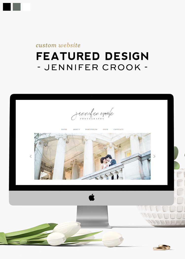
Last month we had a pleasure to work with awesome Jennifer Crook. She is a photographer, and I strongly recommend checking her stunning portfolio. Jennifer had her site created by us a few years ago, but as all websites eventually do, it needed refreshment.
Creating new logo
We started by reworking the logo. The general idea was to keep it black and have her name written in a delicate script font paired with straightforward sans-serif typography. I’m a big fan of such font combos, so I was excited to be working on it. Below you will find three different options I came with.
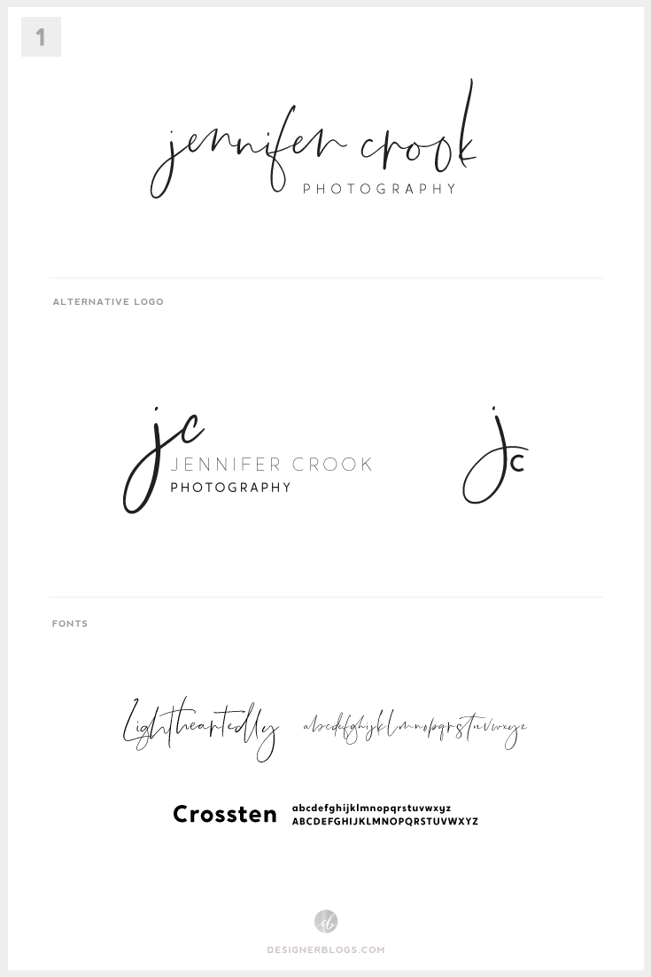
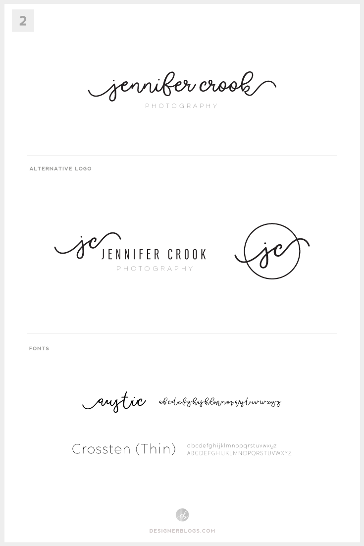
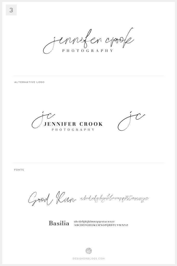
For all the font lovers, here are links to fonts used on those boards which can be found at Creative Market: Lightheartedly, Crossten, Good Run.
As you may notice, the mood boards are really simple. I usually try to incorporate colors and inspirations, which led to creating branding, but there was no point in doing so when the request for the new logo was so specific.
Script font problems
The main difficulty here was finding a script font that will look good with Jennifer’s initials. It is the most common problem with such fonts. Very often, I find myself loving a font, but when I try to use it in the project, the letters do not look as good as on the examples which came with the font.
We were trying a few more options however, the final decision was to use #3 what was not a surprise for me as Good Run font seems to be working perfectly for this type of project.
From logo to design
With the logo ready, we could focus on the website design. Jennifer stated at the very beginning that she like the site to have its content presented in a very minimalistic way. She doesn’t like the full-width area, which is so popular nowadays what is okay. I was thrilled to have a chance to work on something different this time.
Old website look
Here is how her site was looking before the change.
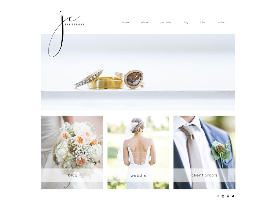
It was a simple portfolio type of website, which was just fine. In my opinion, it aged quite well, and if the code would be okay, Jennifer could still be using that design.
Grand reveal of the new theme
Below you can see the new design. As you may notice, most areas are narrow, and it is how Jennifer wanted them to be. I was a little bit skeptical about this, but now when we have the site ready, I’m in love with this layout.
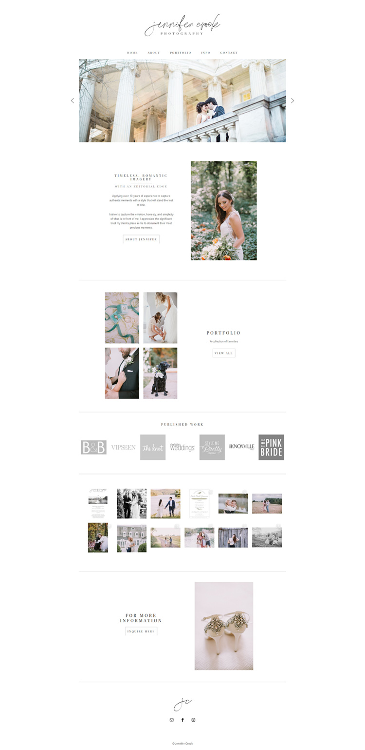
I have helped her create not only the homepage but also all other content pages like testimonials, portfolio, or custom contact forms. Make sure to visit Jennifer site to see how it looks.
Final thoughts
I’m pleased with the final ‘product,’ and I know that Jennifer loves it too, which is the most important thing for me. I have asked her about feedback for this post, and here is what she said:
This is the second time I have used designer blogs to create a website. In both of my experiences; five years ago and now was excellent. Both times I felt my total vision was understood and executed to perfection. The first website designer blogs created for me carried me well for 5 years of my small business. I have no doubt this new site will again help me run my business for another 5 years. You will not be disappointed with the quality of this company.
Thank you designer blogs!!
If you are looking for a custom made design, make sure to contact us via our custom design services page. I would love to chat with you and discuss possible options.


Leave a Reply