
One of the biggest disadvantages that bloggers can create for themselves is the aesthetic of their blog. Readers will judge your blog within the first few seconds of looking at your page. You could have the best content in the world, but if your blog looks sloppy, readers aren’t going to want to stick around.
Here are a few tips on how to clean up your sidebar to make it more appealing.
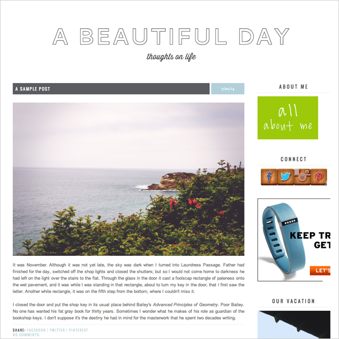
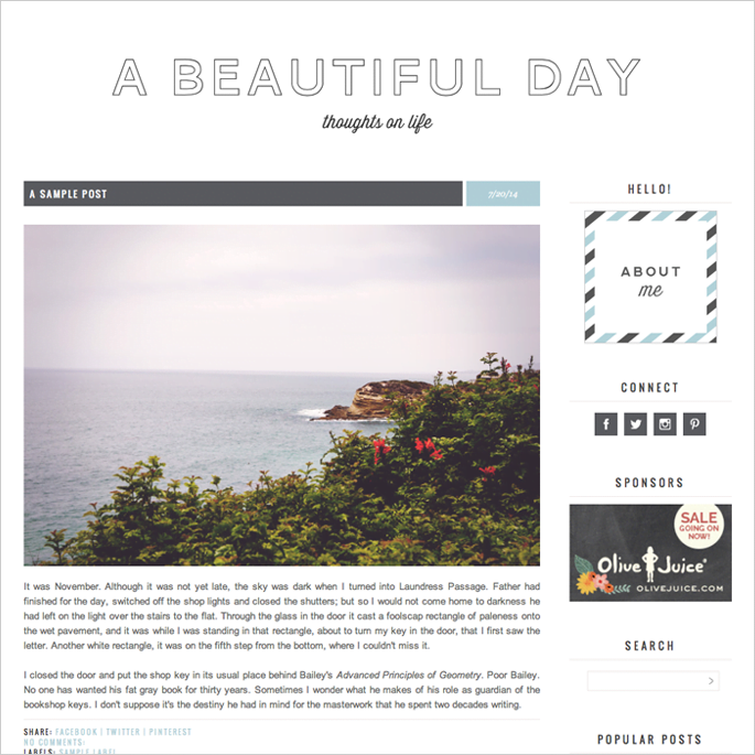
Take the above blog. The basic design is clean and straightforward. The post image is nice. The content is promising.
The sidebar is a distracting mess. The widgets don’t line up, the media buttons are awkward, the ad doesn’t fit. It needs some work.
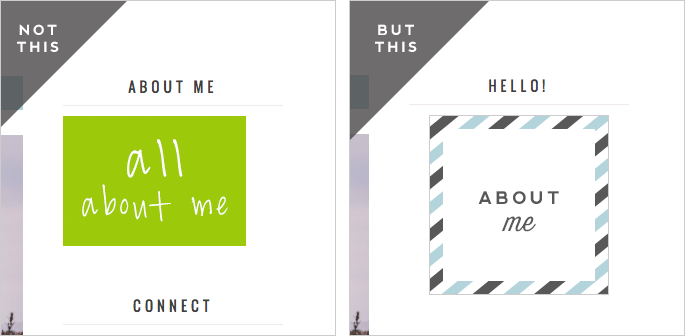
The about section should match the overall look of your blog. I know there a million great fonts out there and you want to use them all, but DON’T! Use the same fonts that come with your blog design. If you don’t know what they are, ask! Ask your designer. Use font identifying sites to see if you can get a close match.
You can see on the example above that example on the right is justified to the left instead of being centered on the page. One of the easiest ways to clean up your page is to make sure that all items are centered in your sidebar. Simply putting <center> before the widget code and </center> after the code will give you a nicely centered item.
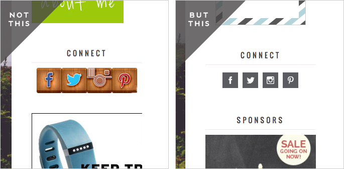
There are hundreds of different social media icons available on the web and it is tempting to use some on your blog that stand out and make them different from other sites. DON’T! Try to find some simple icons that match your site or visit our blog accessories shop and purchase some custom designed ones from us. We’d love to help create coordinating social media buttons for you that blend nicely into your page. The icons themselves are recognizable enough for them to stand out on there own. This is one area where it is best to be understated.
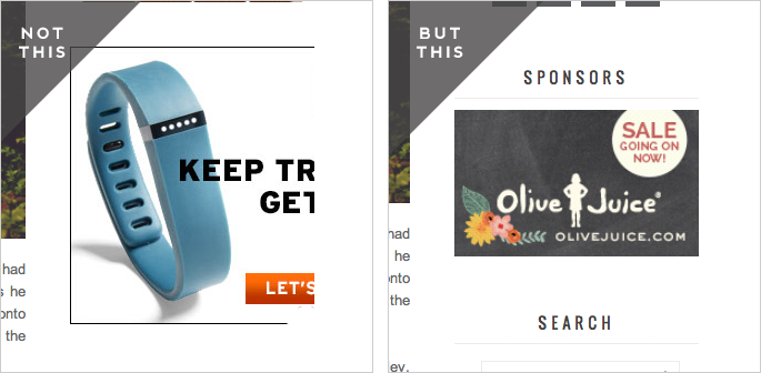
One of the biggest blunders I see with blog sidebars is poorly sized advertisements. Generic ads come in several preset sizes and many bloggers, not knowing the dimensions of their sidebars, put up the ads they like best. This can leave ads that are cut off. This looks terrible and does a disservice t0 the companies that you are representing. Try to place ads that are the width of your sidebar, or a bit smaller so that they fit nicely and can be shown in their entirety. If you don’t know the dimensions of your sidebar, ask your designer. They would be thrilled to help. If you don’t have your own web designer, try downloading Firebug for the the Firefox browser. This plugin allows you to hover over web elements to find out information about them; information like width and height.
A few other sidebar foibles you would do well to consider:
Limiting blog lists.
If you want to make a list of favorite blogs or websites, keep it short. And endless scroll is annoying to readers and is an unwise use of space.
Removing blog counters.
You should care about how many people visit your site. Your readers should not. They should appreciate you for your content, not your popularity. Blog counters can come off as desperate and you aren’t desperate!
Removing blog badges for your friends’ sites.
We know that you are well-intended supporting your girlfriends’ blog – but endless amounts of linky buttons clutter your sidebar and distract from your aesthetic. If you really like a blog or product, write about it. It will be flattering to the subject and will drive more traffic to their site than a sidebar link.
Ah! Now doesn’t that feel better?


It’s much better, Thank you for sharing!
This is an awesome post, I think some of this goes also with the footer of a blog. Keep it tidy 🙂
Thanks Kami! Yes, it definitely also applies to the footer area as well. Thanks for your thoughts!
After looking into a handful of the blog articles on your site, I really like your technique of writing a blog. I book marked it to my bookmark site list and will be checking back in the near future. Take a look at my website as well and let me know your opinion.