Whether we realize it or not, our minds are programmed to respond to color. Color shapes our moods, our thoughts, and our emotions. Because of this powerful subconscious effect, understanding the psychology of color is crucial when building your brand identity.
Your choice of color can make the difference between a customer trusting your business instantly or walking away. It isn’t just about aesthetics; it is a communication tool. In this post, we will show you how to leverage color to build a stronger brand.
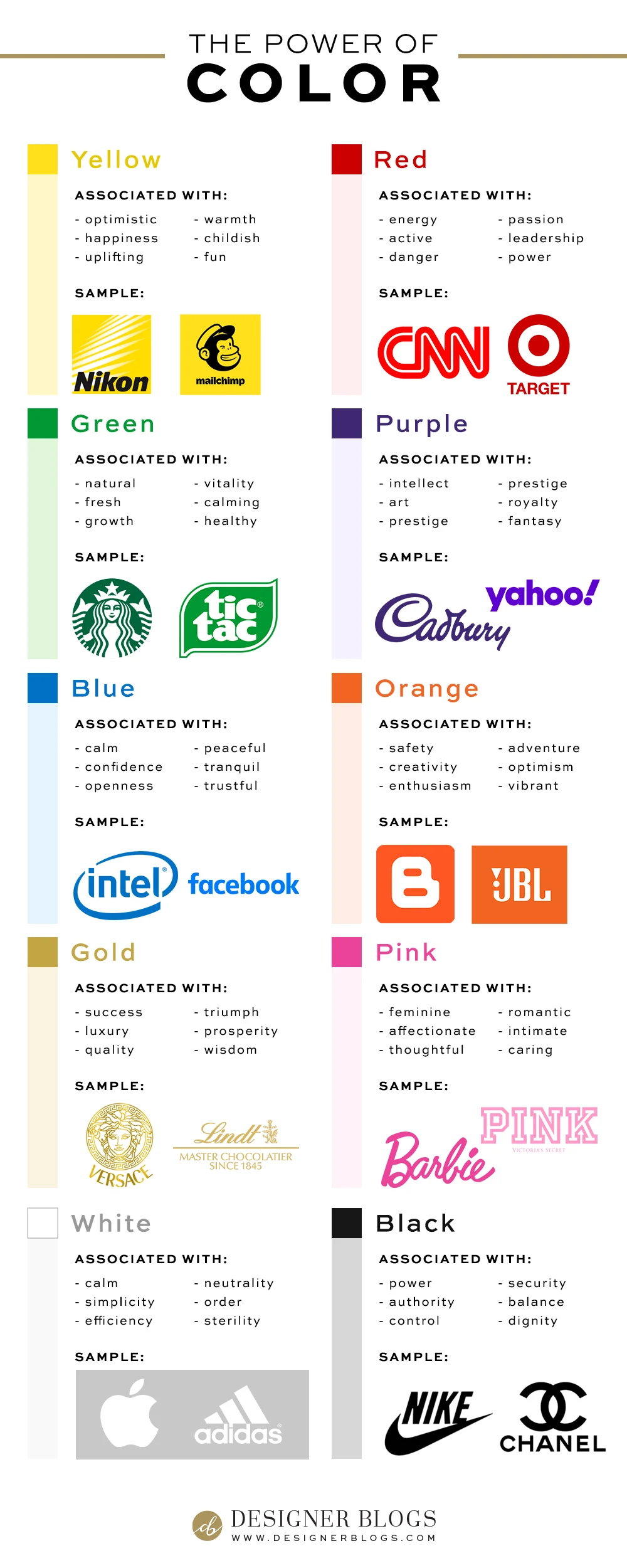
The Psychology of Brand Colors
We have compiled a list of color associations below to help your conscious mind understand what your subconscious is already feeling.
Note: As you review these, don’t just look at what you like. Think about which descriptions best match the core message you want your brand to portray.
Which Color Should You Choose?
The palette you choose must represent your brand personality.
A common mistake is selecting colors based on personal preference rather than strategic impact. It is vital to select colors that reflect your message and appeal to your target audience, even if they aren’t your favorite colors personally.
Consider these industry examples:
- Beauty & Cosmetics: A makeup brand might incorporate pink or black, depending on whether they want to appeal to a sense of youthful playfulness or high-end luxury.
- Food & Beverage: A restaurant owner might personally love the color blue. However, because blue is known to suppress the appetite, it would be wiser to use red or orange shades, which are proven to stimulate hunger.
- Health & Wellness: A fitness brand should lean toward green, as it instinctively signals health, vitality, and growth.
Does Your Brand Match Your Message?
The ultimate goal is to use a palette that resonates with your ideal client and accurately portrays your business’s values.
Based on the color associations above, take a look at your current branding. Do the colors you are using accurately represent your brand’s personality?
If not, give us a holler! We would be delighted to help you realign your design.
Looking for more?
If you are looking for color inspirations, make sure to check our color palette’s library!


Interesting observation about the color association with the blog. Indeed color was found to be an important factor in affecting your mood, so it is always wise to use mood enhancing colors to make the visitors come frequently.
Nice classification really needed for every designer. every designer should have to know the purpose of design and choose the color for it.
Thanks for the info! This was really great and I love it because my blog uses pink as it’s main color. Printing this out as a keeper! I have a question about colors for the holidays. Is it better to use the same colors on your blog/social media that you’re already using and just make it look festive or is it ok to switch to holiday colors?
I think changing to holiday colors during the holiday’s is just fine as long as you still use the same overall blog theme/design you’ve been using and just switching up the colors of it. You don’t want to change things up so much that your readers think they’ve landed somewhere else when they stop by. Hope this helps!
Whoa! This is so cool. Love the info graphic
Thank you. We don’t know what we don’t know. The sub-conscience always knows best.