Nowadays, almost all websites offer you an option to sign up with your e-mail address to be up to date with all the news and promotions. Once you sign up, your e-mail is added to a
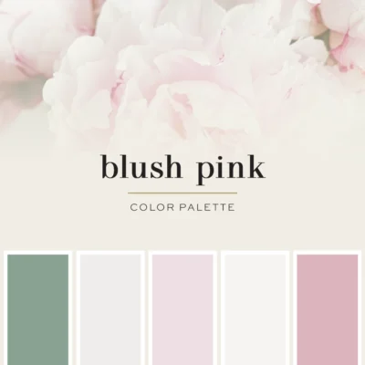
Color Love | Blush Pink
If you're on the lookout for a perfect spring color that's both feminine and stylish, blush pink color palette is the way to go! It looks absolutely amazing when paired with light
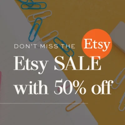
We are now on Etsy! – SALE + Special Promo
I wanted to share some exciting news with you all. Our Etsy shop has been receiving a lot of love lately. Although we've had some tough times with Etsy support in the past, I've
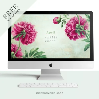
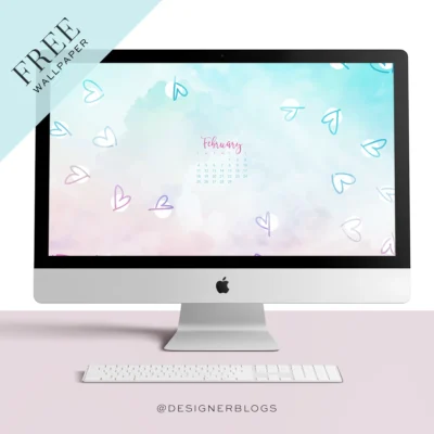
Free April 2024 Wallpaper & Instagram quote
Free April 2024 wallpaper is here! It's finally Spring! Let's kick off this wonderful season with a beautiful flower-themed wallpaper! I picked out some stunning pink peonies
Sort Out Your Business Style With Custom Logo & Branding
Starting a new business is super exciting! And to make your venture even more successful, I suggest investing in custom branding with a professionally designed logo. Trust me, it
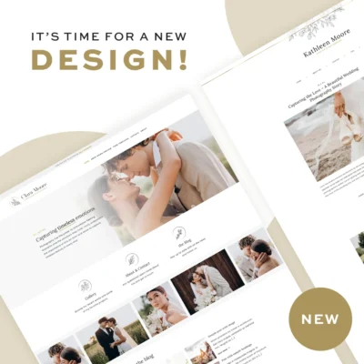
Meet CLARA – New Stylish WordPress Theme
I'm thrilled to announce the latest addition to our shop - a brand-new Stylish WordPress Theme called CLARA. With its clean and simple appearance, it's perfect for displaying your
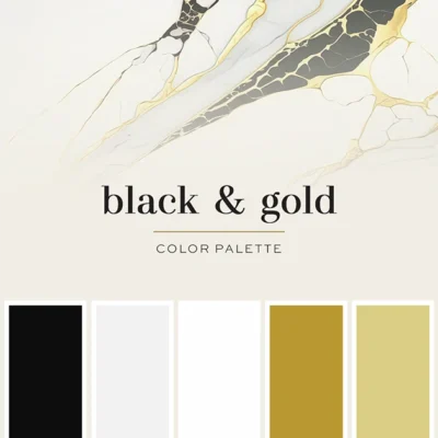
Color Love | Classic Black & Gold
The Black & Gold Color Palette is one of my all-time favorites. It's no surprise that it's the color scheme used for Designer Blogs. I love how versatile it is. If you use more
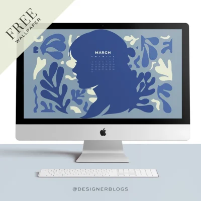
Free March 2024 Wallpaper & Instagram quote
Free March 2024 wallpaper is here! March marks the start of spring, but since we have had numerous wallpapers featuring flowers in the past, I have decided to create a more
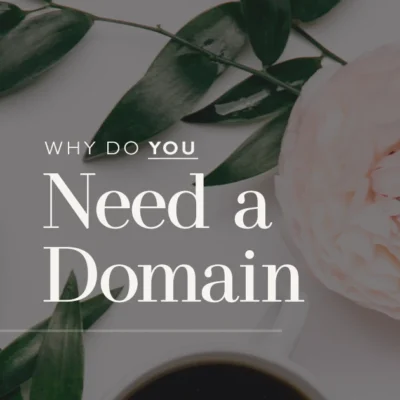
What is a domain name, and why do you need one now!
If you're thinking about creating an online presence, whether it's for your personal blog, small business, or even a Facebook page, one of the first things you should consider is
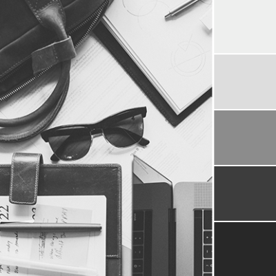
Color Love | Minimalistic Grey
To give you a break from the bright and cheerful pink of February, I've decided to go with a calming and minimalistic grey color palette this month. I know some might think it's
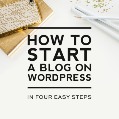
How to Start a Blog or Website (updated for 2024!)
Updated for 2024 Are you a new blogger or a seasoned Blogspot or WordPress.com blogger wanting to switch your blog over to self-hosted WordPress? Or are you wanting to build a
Free February 2024 Wallpaper & Instagram quote
Free February 2024 wallpaper is here! I'm really excited to share with you this new idea I have for our free monthly wallpapers in February. Instead of sticking to the usual